
SpendSmart Mobile Banking
SpendSmart is an all-in-one financial management app that combines the functionalities of traditional banking apps, money-transfer apps, and tap-to-pay apps for an efficient user experience.
Responsibilities
UI/UX Design
Prototyping
Wireframing
User Research
Competitor Analysis
Wireframing
Information Architecture
Context
Personal Project
Timeline
August - December 2023
Tools
Figma, Adobe Illustrator
Final Walkthrough Video
Most mobile banking accounts do not appeal to younger audiences that are accustomed to more simplistic mobile interfaces such as social media applications. These banking interfaces can serve as an obstacle to financial independence and education.
This banking app incorporates traditional banking features (such as checking, savings, cashing checks) with the more approachable interfaces that apps such as Venmo and Cashapp utilize to appeal to younger audiences.
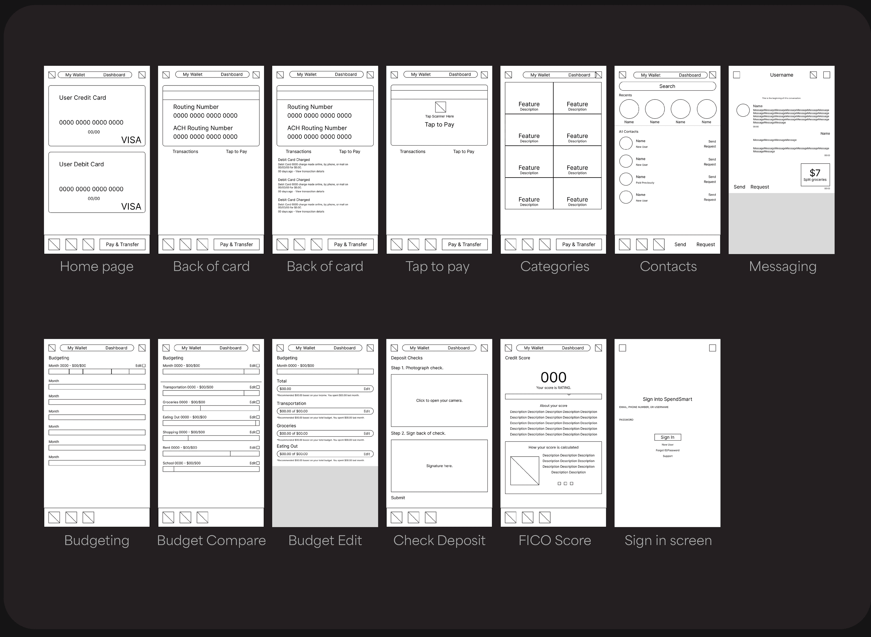
Fast & secure sign-in
Users begin by logging into a previous account or registering for a new account. Fingerprint support enables users to quickly log in with an additional security measure.
All your information at your fingertips
Users can access their debit card number, routing numbers, current balance, transaction history, and tap to pay feature on the first screen of the app. The home screen uses an image of the user’s physical card, which gives users a tactile, intuitive banking experience that feels comfortable and familiar to users of any age.
Saving can be easy and accessible
The savings account screen mimics the interface of the debit card screen, and is accessed from a simple swipe. The wallet is expandable and can contain an infinite number of cards or accounts. Transferring funds is similar to traditional banking apps which provides a familiar experience.
The first banking app with message support
SpendSmart reimagines the traditional structure of banking apps. Social support allows for a reassuring and safe experience when sending funds to friends through Zelle, and a social network encourages users to invite their friends to SpendSmart and expand the app userbase.
Set budgets with in-app tools
Users can view data provided directly within the app to learn and evaluate their spending habits. A drop down menu allows the comparison of previous months to keep track of budgeting progress and building healthy habits.
The most features out of any banking app
SpendSmart organizes features in a structured menu called categories, which encourages exploration and allows for easy expansion and updates. Users can access any feature in only two clicks, without being overwhelmed by content. All the traditional banking features, such as checks and credit score, are here.
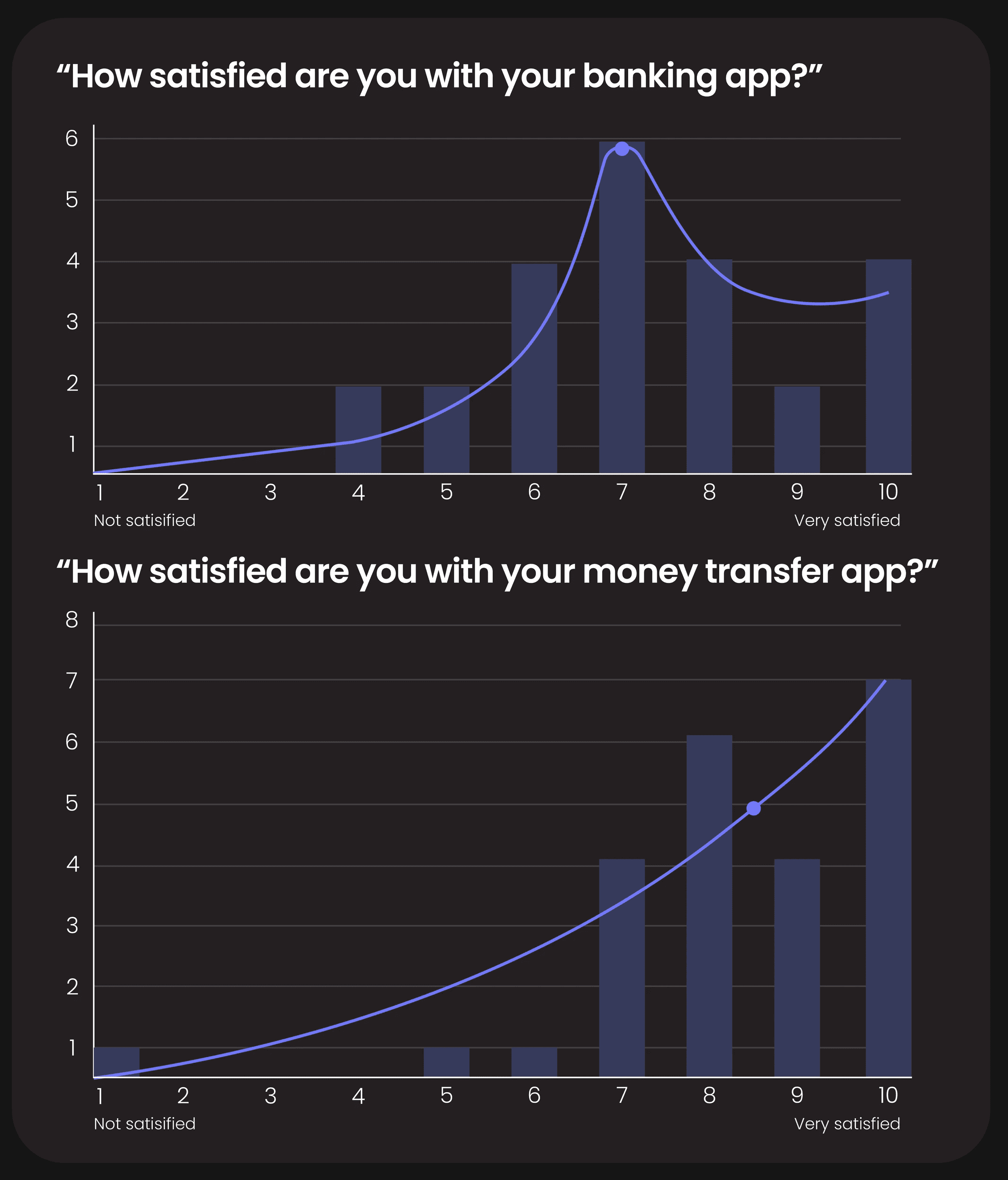
In testing, SpendSmart was up to five times faster to use.
I recreated a prototype of Bank of America to conduct user testing. During testing, users were able to complete tasks up to five times faster in SpendSmart, and noted decreased confusion and increased ease of use. Below is a visualization of this testing.
A video demonstrating the differences in user testing between SpendSmart and Bank of America.
Banking apps and money-sharing apps often have exclusive features.
I analyzed the interfaces of three mobile banking apps and three money-transfer apps. Bank of America and Chase both had most financial features available, so I referenced them the most during my user research.

Most people prefer their money-transfer app interface.
I surveyed 24 college students to learn about their preferences and aversions to features in both traditional banking apps and money transfer apps.
While conducting interviews, I learned that users strongly prefer their money-transfer apps due to their intuitive, clean interfaces and simplistic design. Conversely, users are frustrated by the difficulty of finding features they need, having poor information hierarchy, and a lack of features.
Young adults would be a potential audience for a new banking app.
I created a user persona of a college student that would test the new banking app. I referenced this persona throughout building the app to approach the problem with a user-first mindset.

The app would benefit from a simple, hierarchical user flow.
I looked at the most important user flows within traditional banking apps based on my survey results.
Most surveyed users primarily use features such as debit cards, savings accounts, budgeting, and exchanging funds with friends.
I charted out these flows with the least number of clicks possible, because these features are often used daily and should be streamlined for users.

Clean, straight-forward branding is most accessible and familiar to users.
I created a simplistic brand identity that would quickly align with user expectations for a banking application.

Lofi wireframes
I created low fidelity frames of each feature I wanted in the app. I built the app around the visual, tangible experience of a debit card, as well as creating a modular features page.
Final Walkthrough Video
Video walkthrough of SpendSmart
Final Thoughts
If this app were to be developed, I feel confident that it would be a strong competitor for major banking apps such as Bank of America and Wells Fargo due to its unique approach to making banking accessible and all-in-one. The efficient user experience synergizes with the minimal user interface to be a highly marketable and successful solution to financial difficulty in college.