


The Diverse BookFinder Website Redesign
Diverse BookFinder is a comprehensive collection of children's picture books featuring Black and Indigenous people and People of Color. They offer a first-of-its-kind, searchable database of their collection for educators and readers.
As one of the two UI/UX designers rehired for this project, I worked with five Diverse BookFinder stakeholders to implement my previous team's rebranding, as well as redesign several pages of their website. They asked to continue shifting the scope of their research tool to be more in line with their new audience of middle-school and high-school aged children.
We were asked to create eight responsive pages for desktop, tablet, and mobile viewports as well as update the website navigation in 12 weeks. This project has been developed and can be viewed at diversebookfinder.org.
Responsibilities
UI/UX Design Leadership & Design Collaboration Prototyping Developer Hand-off User Research & Journey Mapping Wireframing Information Architecture Figma Autolayout
Client
Collaborators
Timeline
April - August 2023
Tools
Figma, FigJam, Adobe Creative Cloud
Timeline of the whole project.
Learning about New Navigational Strategies
We used pre-existing visitor analytics in combination with input from the DBF stakeholders and web specialist to determine a navigational layout that is accessible and inviting.
Through six collaborative iterations, (shown below), we determined that a navigation with the primary website features on the top-level navigation with an extending mega-nav would be most efficient for users and allow for the dynamic addition of new features.
We reimagined the vocabulary used in the navigation by replacing unknown words. Technical labels such as "Highlight" and "CAT" were substituted with action words such as "Discover" and "Research" to encourage users to feel invited to explore the website, regardless of their current age or reading level. This also makes the site more digestible for younger audiences.
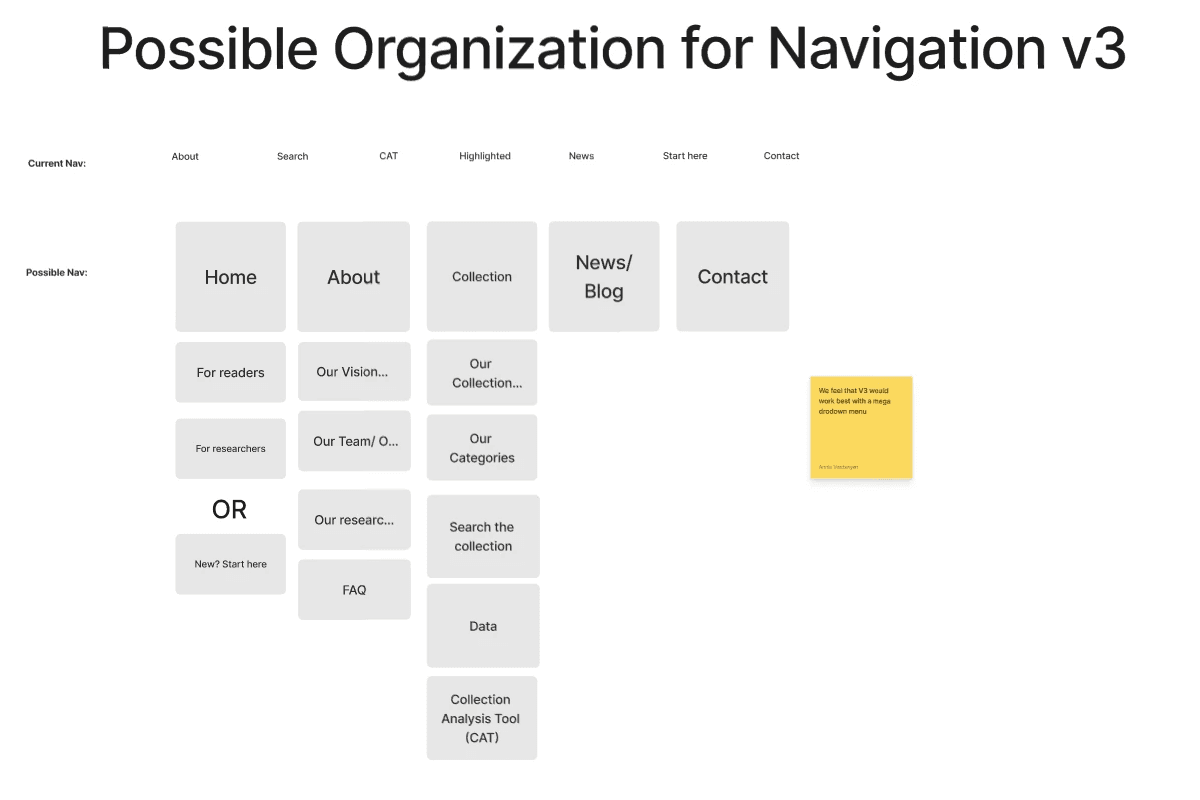
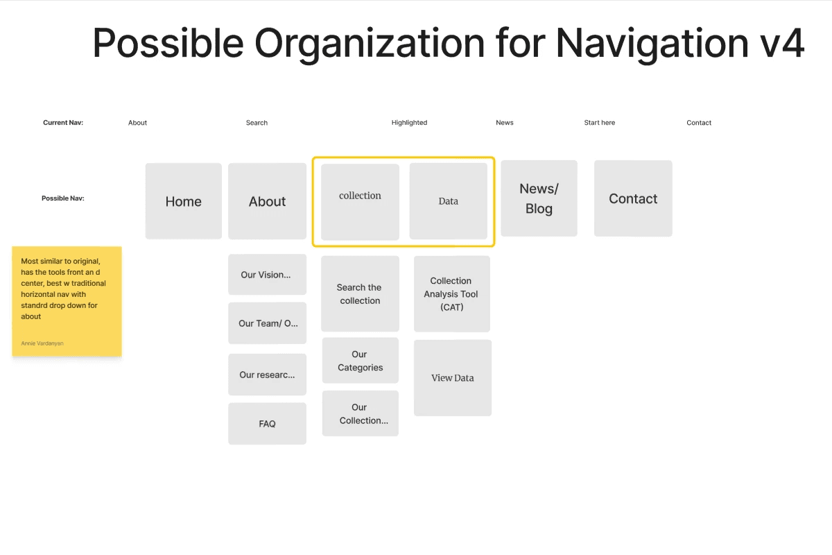
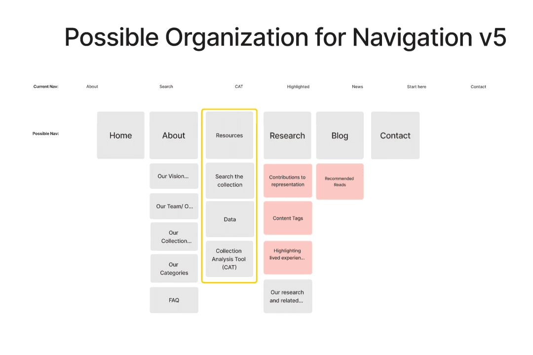
Slideshow of six figjam boards with six proposals for different navigational layouts, starting with the chosen version.
Creating a Colorful Meganavigation
After the user flow was created, we created the new navigation. It includes the typeface and branding assets outlined in our branding package, as well as extending into a full-width meganav. The navigation has a focus on friendly and inviting vocabulary to invite users to explore the different features.
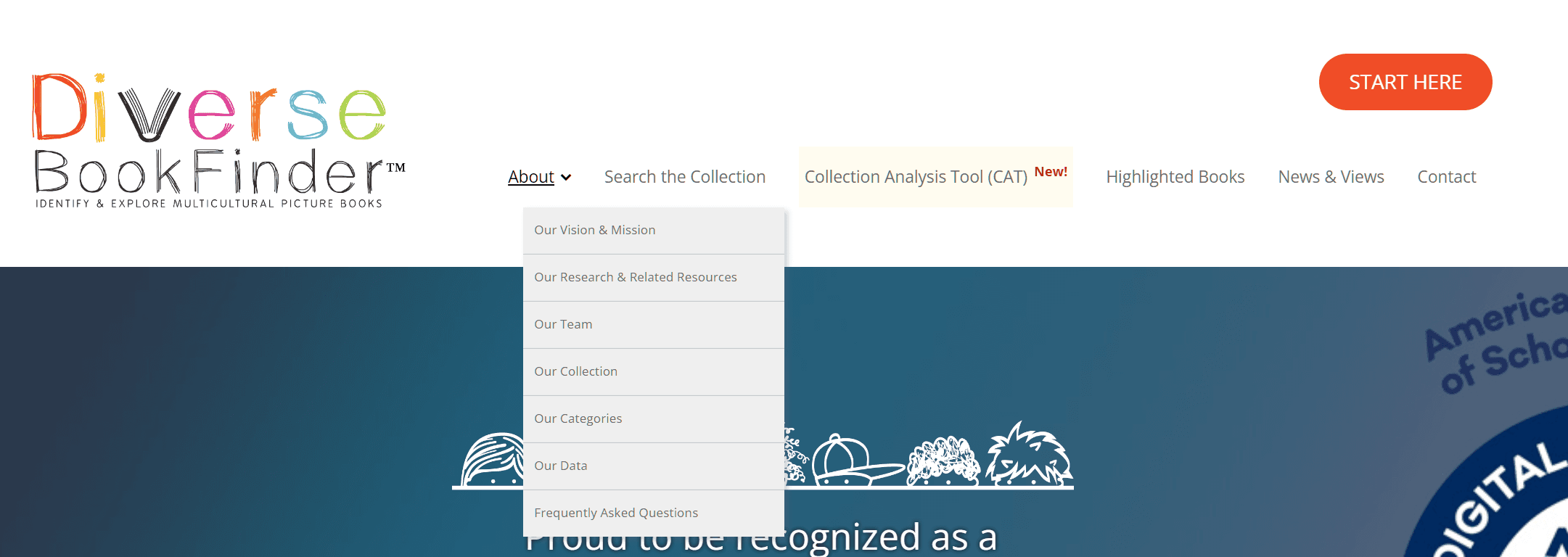
The original navigation
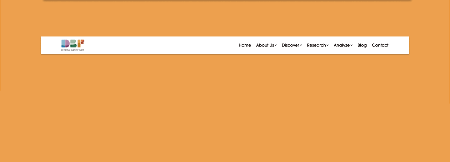
An animated gif of the new navigation section.
The Homepage
The homepage needed to be condensed, and reflect the support and inclusion in DBF's messaging and branding. We created a card system to add structure to the page, as well as adding additional context to some features.
The logo motion graphic (shown at the top of this page) and card resources add much-needed color and imagery to the homepage, which previously had no images.
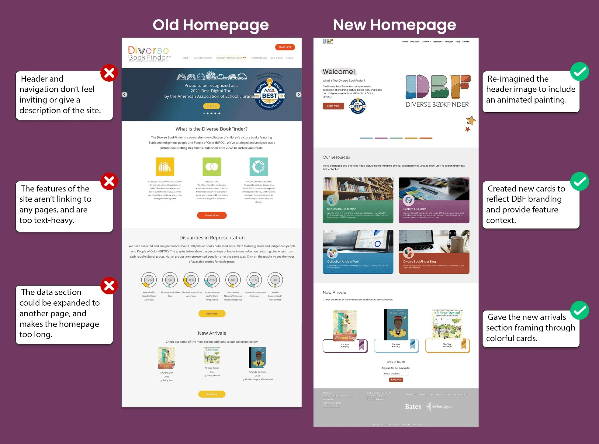
Side-by-side analysis of the original homepage (left), and new homepage (right).
The Data Page
DBF collects an extensive amount of statistics about the organization of their database, but it was previously limited to the homepage. We opted to flesh this content out into its own dedicated page, as a way to show off their detailed collection of books.
This section showcases two infographics that update to reflect the collection every time a book is added.
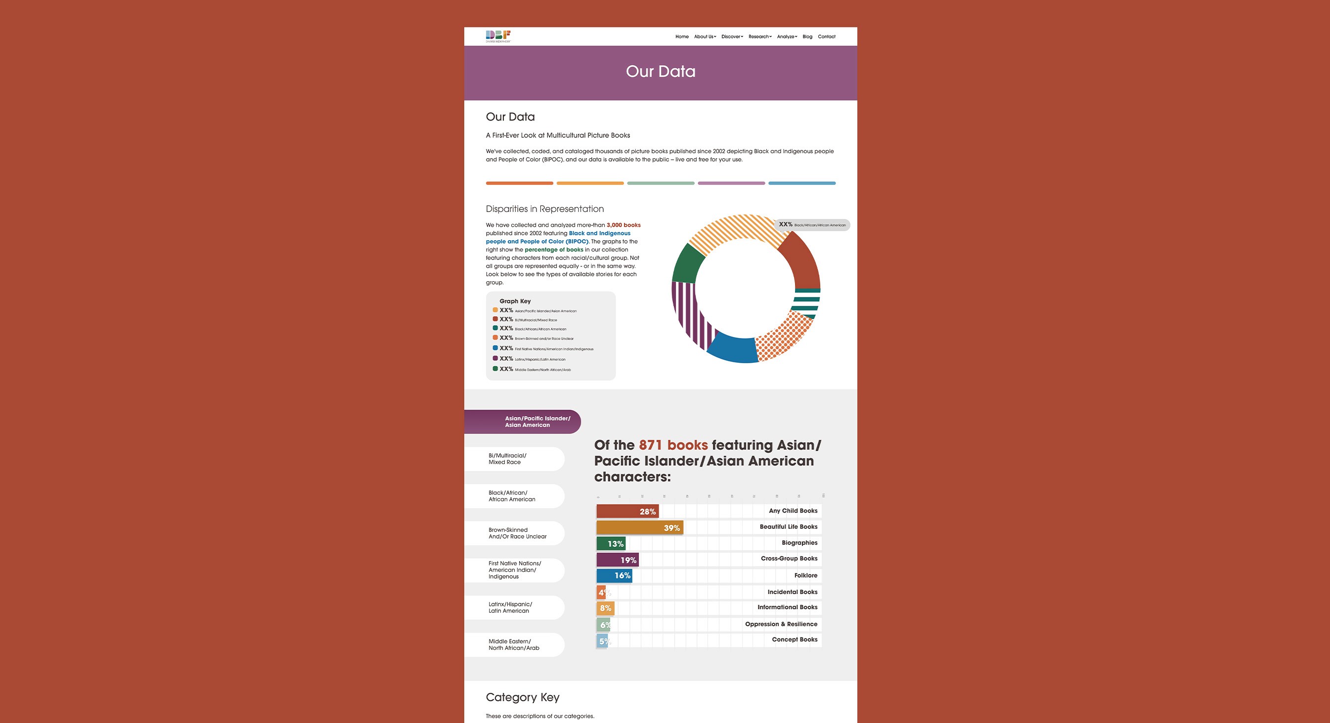
Image of the new "Our Data" page.
The Team Page
The teams page was very long to read, did not have much hierarchy, and was not able to accommodate new team members and volunteers.
The new teams page utilizes a modular side-navigation menu that allows users to quickly sort through the hundreds of team members and quickly open their biographies to learn about them. Below you can see the original page (left), and new pages (right).
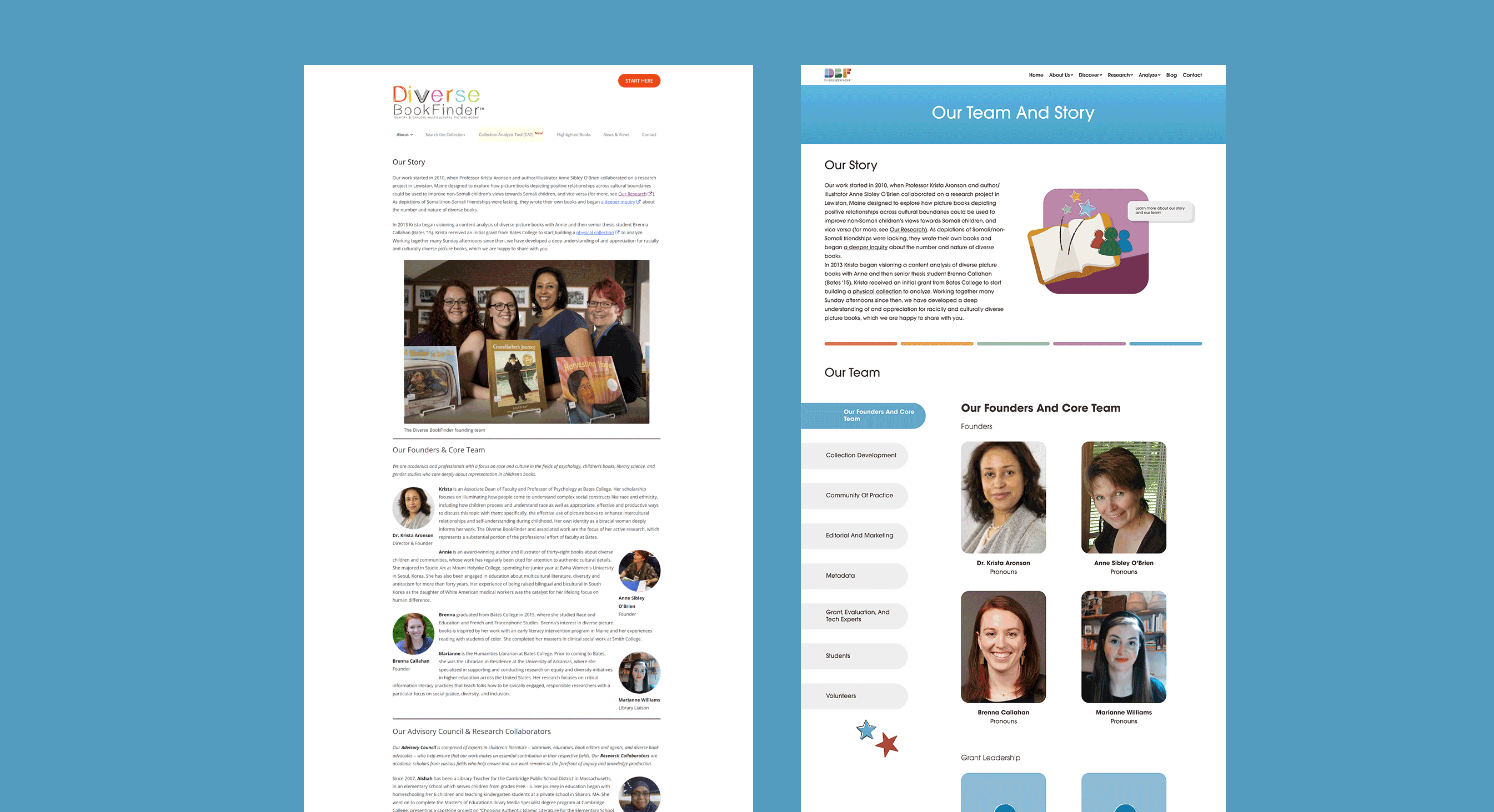
Side-by-side analysis of the original teams page (left), and new teams page (right, animated).
Dev Handoff
Throughout the process, we annotated every minute aspect of our design. We organized our project in a standard dev hand-off format including user flows, button states, and breakpoints for mobile and tablet views. Throughout the 12 weeks, we checked in with DBF's web developer to share progress and collaborate on the optimal handoff technique. For this project, we chose to deliver the files to the developer all at once.
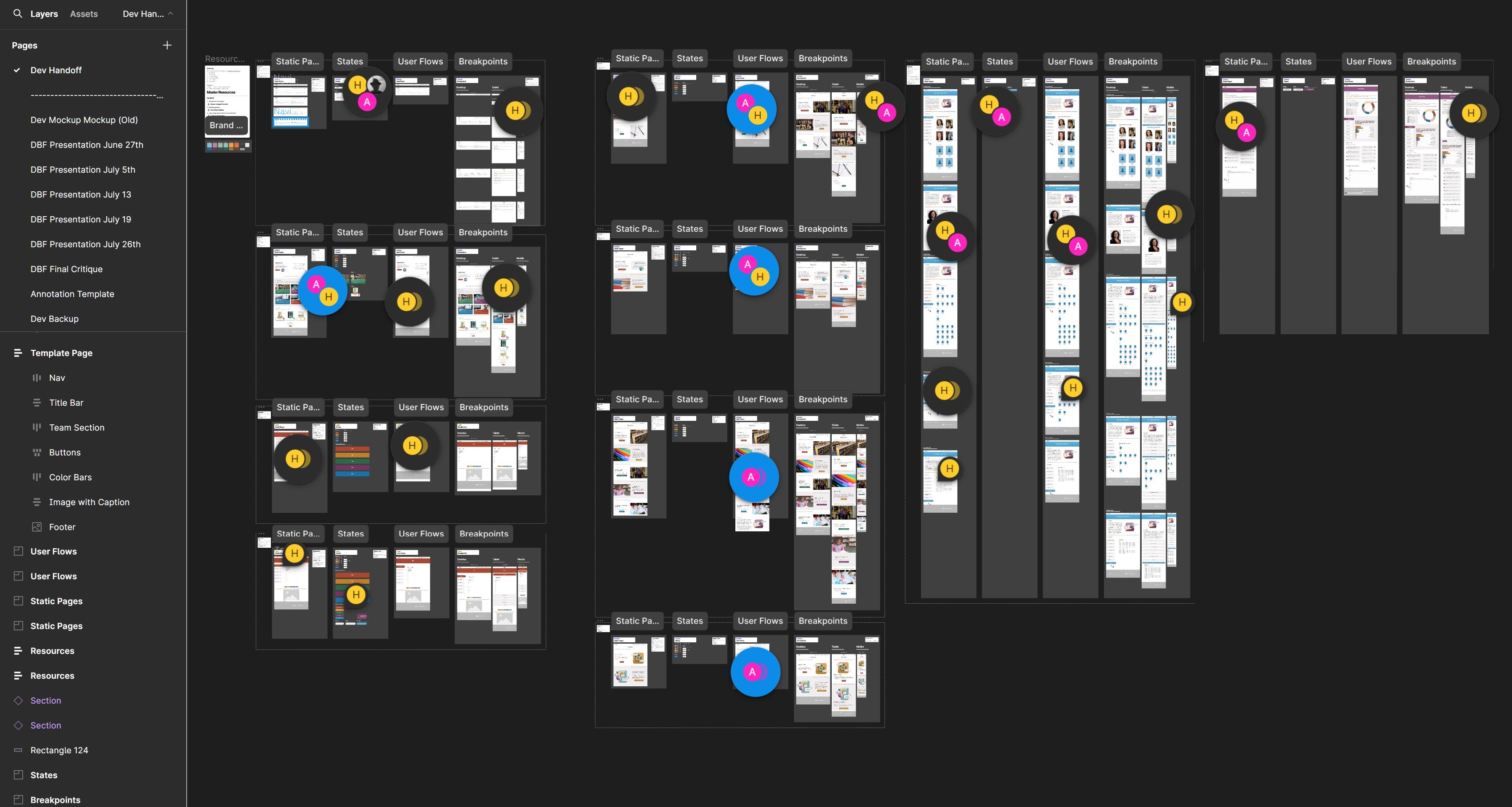
Overview of the dev handoff documentation.
Creating Responsive Layouts with Autolayout & Wrapping
We made each frame able to quickly adapt to any screen size from Desktop (1440px), Tablet (1190px), and mobile (810px) to give our developer the most accurate visualization of the website design. This made communication easier and ensured that our designs would work on any device.
Some of frames of the mega-navigation menu, with auto-layout.
90% of websites are inaccessible to people with disabilities
Throughout the process, we prioritized making the site accessible for everyone. Thoughtful language, minimal transitions, large text size, and permanent alt-text for images and diagrams were integrated into the design to make Diverse BookFinder easier for everyone that uses it.
Closing Thoughts
Throughout the process, I've learned the importance of keeping frames organized, client communication, and patience when creating flexible layouts. This project inspired me to continue developing complex, research-driven interfaces and designs.
I'm extremely proud of the effort Ani and I put into bringing DBF's colorful vision to life, and thankful for the help and support of the DBF team and developer! I look forward to seeing the continued growth of Diverse BookFinder.
Thank you for reading! (Back to top)